This post is a before and after of my sister's landscape garden beds over the past 15 months. It is intended to be an inspiration to anyone out there who thinks they can't do it, don't know where to start, or how to logically make a healthy landscape garden happen.
In 2015, my sister C decided to tackle her years neglected landscape plantings surrounding her home's back deck. The immediate needs were to weed, cut back, and purge overgrowth.
She started this in March of 2015, patiently and methodically going about weeding small patches at a time for nearly two months. She would work as her stamina allowed, usually one or two hours at a time.
By early May, she had made a really noticeable dent in the work. The really difficult part, she noted, was trying to cut through the old landscape fabric that had originally been intended to keep weeds at bay. What happened, in actuality, is established plants' roots were beneath that fabric, weeds had crept in over top of the fabric, and cutting through it all was a HUGE effort. That stuff doesn't cut well once claydirt mud is trapped within its fibers among the roots, weeds!
I volunteered to help my sister by setting aside some of my own divided plants that spring. I thinned out nandina, hosta and black-eyed Susans (pictured below) to ultimately fill the spaces cleared in sister C's landscape beds.
I helped my sister position the starter plants within the cleared areas of the mostly full-sun beds, based on my own experience and knowledge of their expected heights at maturity. Her husband dug most of the holes, and she amended the claysoil mud with purchased garden soil before planting. Sister C also divided some of her own plants (liriope), so she could create some symmetrical plantings on either side of the steps of her back patio
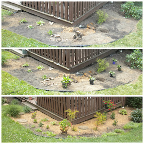
A couple of very stubborn roots of old plants were left to make the proverbial lemonade - my sister used them as lifts for added container plants! Below is a photo of the progression of the most highly visible corner from the curb - May through June, 2015.
The downward slope of the beds which follow the above corner were weeded, and river rock added to prevent the mulch from washing away during summer rains.
I returned in July and took a quick photo of the bed with most significant change. Plants were thriving in the hot sun, and alyssum (from seeds purchased inexpensively at Family Dollar) was blooming all along the borders of the bed. Much improved, wouldn't you agree?!
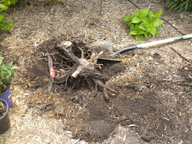
Fast forward to 2016. My sister continued efforts to focus on these beds closest to the perimeter of her back patio. I divided more plants - nandina, black-eyed Susans, buttercups, and bee balm - and took them to my sister in May, 2016. Some of those roots from old plants were in the way of prime positions for some of the new prospects. So, I dug them out!
We then amended the clay soil once again, and moved a few plants which were already in place.
More nandinas were amassed among the prior year's plantings (above photo).
Buttercups were placed where the removed root ball had been (above photo, just behind the small white plaque in dirt), and bee balm behind it, against the fence wall.
More black-eyed Susans were planted in the bed on the other side of the steps (middle of above photo). Hostas were emerging from the prior year, as well as a few alyssum at the border.
New lavender and Asiatic lilies (Mother's Day gift) were moved for better spacing.
The bed looking from the corner and the slope downward, to the rock beds, May 2016.
The above photo shows comparative shots taken in 2016. The top frame shows the beds in May, after planting but prior to mulching. The lower frame shows the beds in July, after mulching and much growth.
My sister and her husband have also had some major tree trimming completed, and they've also worked themselves on the house front beds, around trees, and plantings (weeds, overgrowth) around their shed. Since I didn't have those before photos, I didn't think it would be as dramatic to see the after changes in those spaces.
All of this has been quite a transformation in just 15 months! Taking photos and journaling your garden really helps you realize just how much transformation does occur when you care for it and nurture it. I am so proud of my sister's efforts in what's she's done here, and happy some of my plants helped her realize the changes for no added cost. Sister C deals with some chronic health issues, which makes this transformation an even bigger deal. Best of all, gardening grows the spirit!
Do you have a garden area you've transformed recently, or know someone who has made some changes to theirs in a big way? Were you a part of seeing the changes? Isn't it amazing to witness the change first hand? Share your dirt!
(A huge thank you to Kathryn's readers at The Dedicated House's Make It Pretty #190 Showcase for making this a top-viewed post!)
Sharing: Amaze Me, DIDI, BNOTP, Show & Share, Make it Pretty, The Scoop, Vintage Bliss Tuesdays, Thrifty & Vintage Finds, Celebrate Your Story, Let's Talk Vintage, Talk of the Town, SYC, Delightsome Life H&G, TOHOT, Vintage Charm, Foodie Friday & Everything Else, FNF
In 2015, my sister C decided to tackle her years neglected landscape plantings surrounding her home's back deck. The immediate needs were to weed, cut back, and purge overgrowth.
By early May, she had made a really noticeable dent in the work. The really difficult part, she noted, was trying to cut through the old landscape fabric that had originally been intended to keep weeds at bay. What happened, in actuality, is established plants' roots were beneath that fabric, weeds had crept in over top of the fabric, and cutting through it all was a HUGE effort. That stuff doesn't cut well once clay
I volunteered to help my sister by setting aside some of my own divided plants that spring. I thinned out nandina, hosta and black-eyed Susans (pictured below) to ultimately fill the spaces cleared in sister C's landscape beds.
I helped my sister position the starter plants within the cleared areas of the mostly full-sun beds, based on my own experience and knowledge of their expected heights at maturity. Her husband dug most of the holes, and she amended the clay
A couple of very stubborn roots of old plants were left to make the proverbial lemonade - my sister used them as lifts for added container plants! Below is a photo of the progression of the most highly visible corner from the curb - May through June, 2015.
The downward slope of the beds which follow the above corner were weeded, and river rock added to prevent the mulch from washing away during summer rains.
Fast forward to 2016. My sister continued efforts to focus on these beds closest to the perimeter of her back patio. I divided more plants - nandina, black-eyed Susans, buttercups, and bee balm - and took them to my sister in May, 2016. Some of those roots from old plants were in the way of prime positions for some of the new prospects. So, I dug them out!
We then amended the clay soil once again, and moved a few plants which were already in place.
More nandinas were amassed among the prior year's plantings (above photo).
New lavender and Asiatic lilies (Mother's Day gift) were moved for better spacing.
The bed looking from the corner and the slope downward, to the rock beds, May 2016.
The above photo shows comparative shots taken in 2016. The top frame shows the beds in May, after planting but prior to mulching. The lower frame shows the beds in July, after mulching and much growth.
My sister and her husband have also had some major tree trimming completed, and they've also worked themselves on the house front beds, around trees, and plantings (weeds, overgrowth) around their shed. Since I didn't have those before photos, I didn't think it would be as dramatic to see the after changes in those spaces.
All of this has been quite a transformation in just 15 months! Taking photos and journaling your garden really helps you realize just how much transformation does occur when you care for it and nurture it. I am so proud of my sister's efforts in what's she's done here, and happy some of my plants helped her realize the changes for no added cost. Sister C deals with some chronic health issues, which makes this transformation an even bigger deal. Best of all, gardening grows the spirit!
Do you have a garden area you've transformed recently, or know someone who has made some changes to theirs in a big way? Were you a part of seeing the changes? Isn't it amazing to witness the change first hand? Share your dirt!
(A huge thank you to Kathryn's readers at The Dedicated House's Make It Pretty #190 Showcase for making this a top-viewed post!)
Rita C. at Panoply


